I recently photographed several performers at the Bermondsey studio, including Sibyl Grimm who I previously worked with at Bella Whispers. Sibyl is a talented singer, burlesque performer, and emcee known for her Old Hollywood charm, quick wit, and humour. Upon learning of her upcoming one-woman show, I invited her to be part of my studio shoot day. I envisioned creating a poster to promote her performance, similar to the ones I had made for the Clocktopus Cabaret a few years prior.
In the initial shot I took, I had a concept of featuring Sibyl on one side of the poster with the text running down the other side. I considered placing her on either the right or left side but ultimately decided to put her on the right.


I later cropped the image to a 4:5 aspect ratio, which is suitable for social media platforms like Instagram and Facebook. I've grown accustomed to this shorter and wider ratio, rather than the traditional 4:6. I applied the Rule of Thirds and aligned the rightmost vertical line with Sibyl's body, even though her head was tilted to one side. Her figure still occupied one-third of the shot, creating a balanced composition.
Sibyl and I decided on an Avant-garde theme, fitting for her 1920s background. I added an appropriate background and a vignette, as well as 1920s-style text. While the image was decent, it still felt flat and uninviting to me. The shells in the background may have been too large, but for me, the overall image just wasn't quite right. So, I went back to the drawing board.
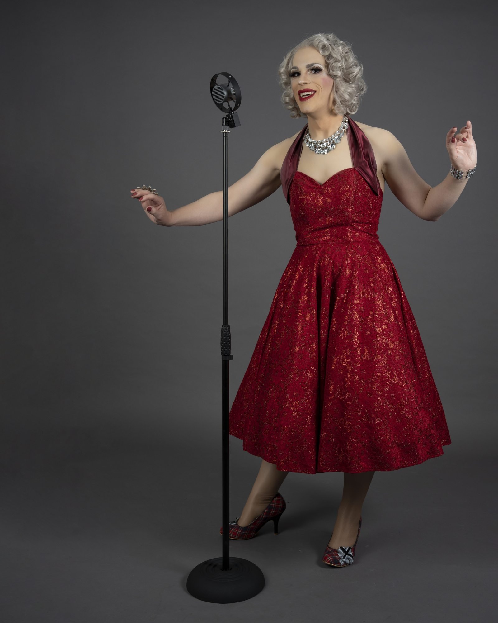
For my second attempt, I aimed for a more show business look. The image captures Sibyl mid-swing, and the red dress stands out from the frame. The image is more entertaining and suggests a nightclub setting with the background. I darkened the surrounding area with a vignette while brightening up the dress and face.


In my next attempt, I experimented by adding some lyrics from the songs Sibyl sang at her shows. However, I soon realized that this didn't align with our goal of promoting the show, rather than individual songs. So, I reused the text from the previous image and overlaid it in the lower centre of the image, hoping the viewer's attention would first go to Sibyl and then down to read the text.
Comparing the two images, this one was a clear improvement.
For this shot, I once again used the red dress and a 1920s-style microphone positioned slightly off-centre. Sibyl was placed on the right third of the image, allowing the text to flow down on the left. I added a blue background to contrast with the red of the dress and pulled a border and emblem from my resources folder to fit the theme. This time, I also included the names of the songs as well as the details of the show.

This shot turned out much clearer, featuring Sibyl directly facing the viewer. Her name is prominently displayed, and the text is easily readable. The overall look is clean and professional.

I had a great time working on this project and I am looking forward to more opportunities to create similar works in the future!